TeenSafe - Design System
Building a design system to ensure safe driving
Client
TeenSafe
Project
Design system
Duration
6 months
Team
1 head of product,
1 visual designer,
2 engineers
My role
Brand, design system, illustration, UI design
Overview
Background
TeenSafe is a leading parental controls app that focuses on monitoring device usage in teenagers. While the app can monitor many different activities on teens’ phones, TeenSafe noted that distracted driving was an increasingly pressing issue among teenage drivers. They shifted their focus to the distracted driving epidemic. Existing tools only monitored the problem and did little to encourage healthier driving patterns. TeenSafe wanted to take direct action and teach safe driving behaviors through prevention, enforcement, awareness, and engagement.
Partnering with the Head of Product and another visual designer, I helped build a revitalized TeenSafe design system that embraced the company’s mission.
Goals

Un-technalize
The original brand felt very sterile and TeenSafe wanted to shift perception about parental controls being a governing app to being a companion in safer behaviors.

Improve team collaboration
Without a proper design system in place, passing files among designers and developers was messy.

Accelerate time to market
Since TeenSafe was creating new products, they needed a system that could allow them to test and iterate on them.
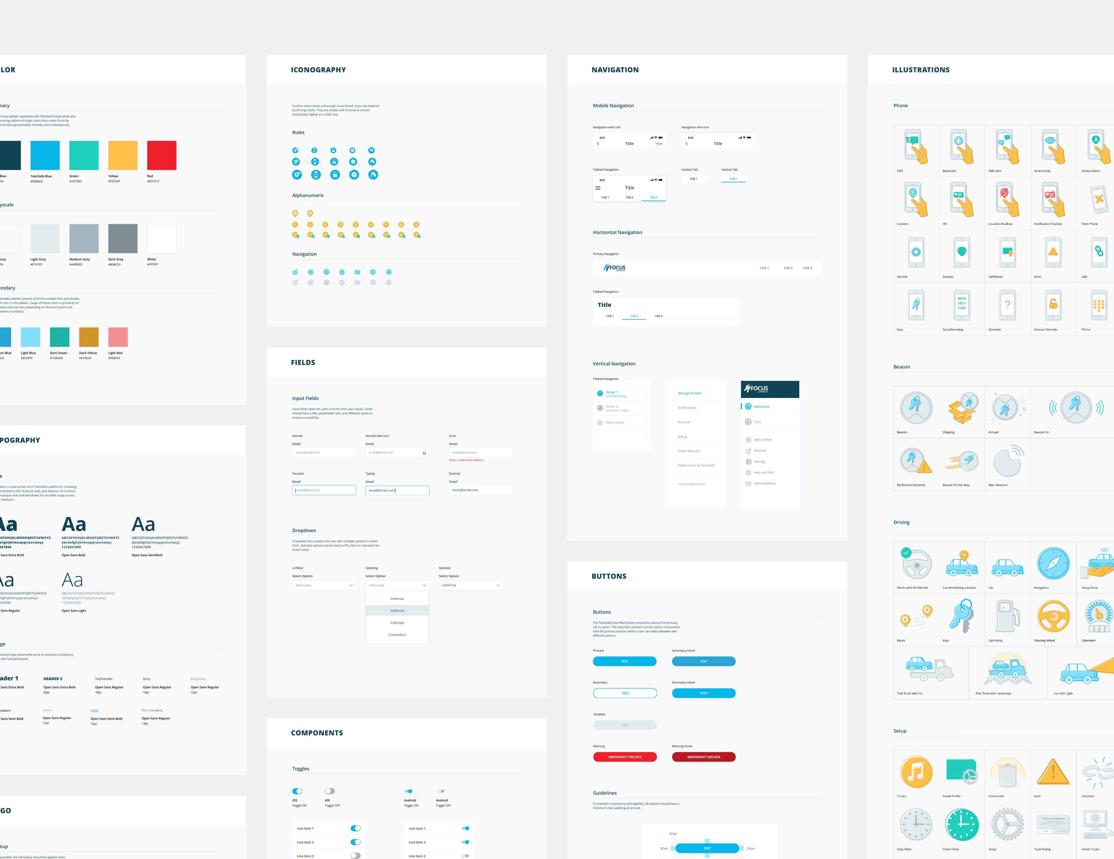
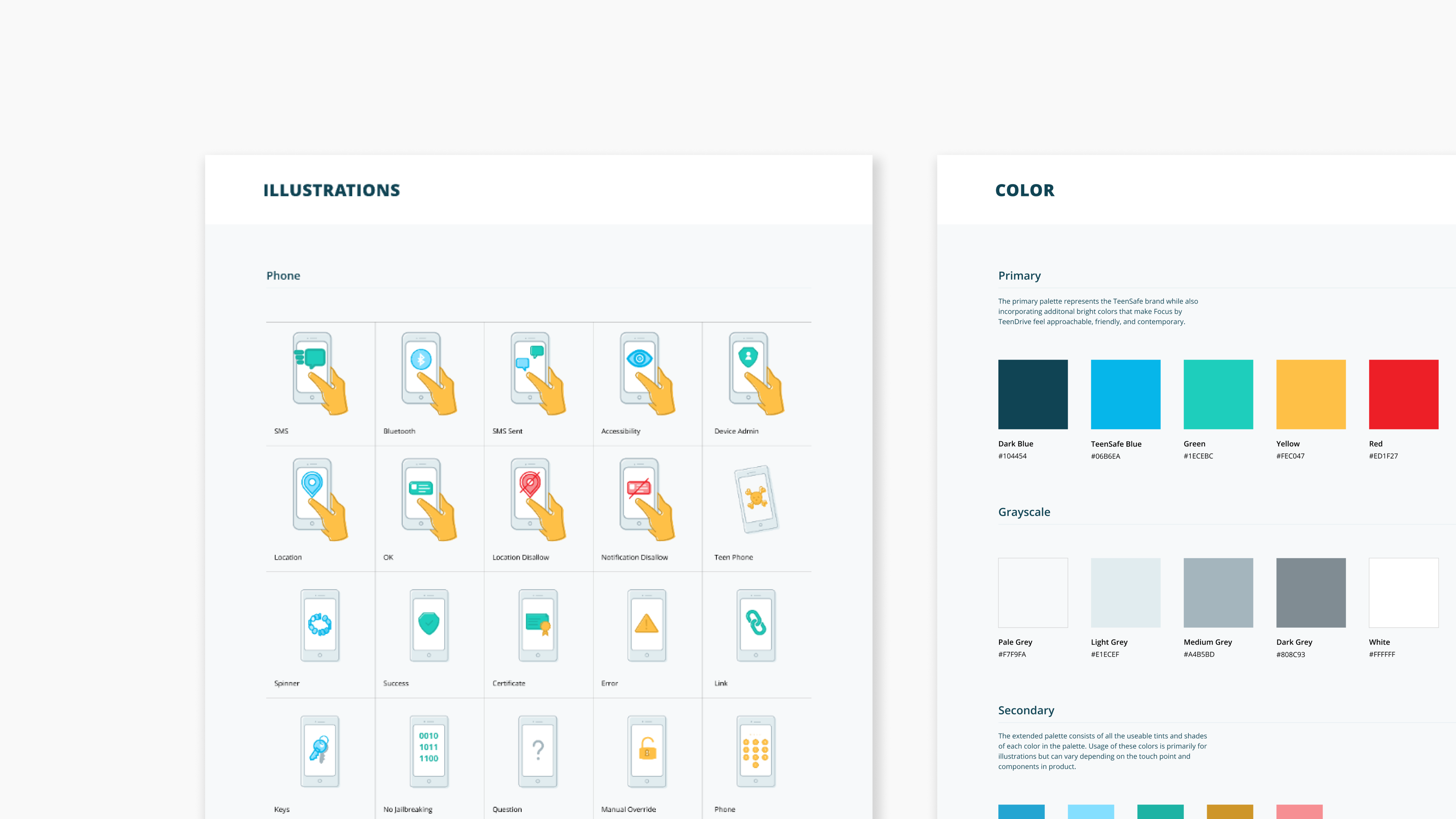
TeenSafe style guides
Out with the Old, In with the New
The strategy
When I joined the TeenSafe team, user testing and research had already been done. I reviewed documentation, user needs, and existing competitors. Through this discovery process, I learned that parents wanted to ensure their teenage kids’ safety while driving, but had difficulty with productive conversations around proper driving habits.
The existing TeenSafe design system was littered with inconsistencies and didn’t match the tone and feel of TeenSafe’s revamped vision. We wanted to appeal to parents but not jeopardize their relationships with their kids. TeenSafe needed to feel safe and friendly.
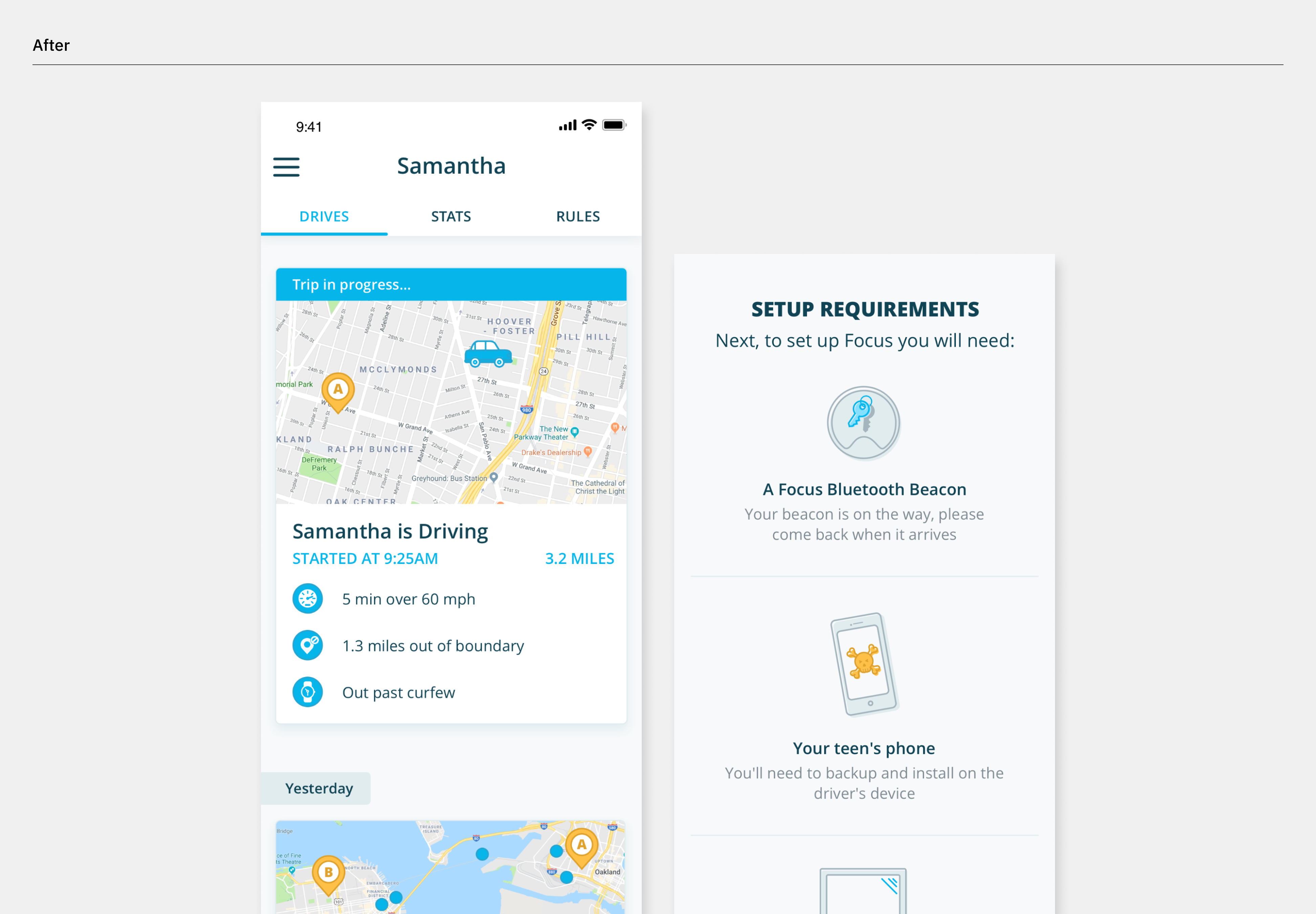
Before and after dashboard redesign
Making Way for the Design System
Defining new colors
Implementing a revised color palette was the first challenge as the previous one felt too dull. I chose bright, modern colors were to create a more cordial and human feel. Though distracted driving is a serious topic, it was crucial to give users a feeling of warmth and security and not use serious or alarming colors.
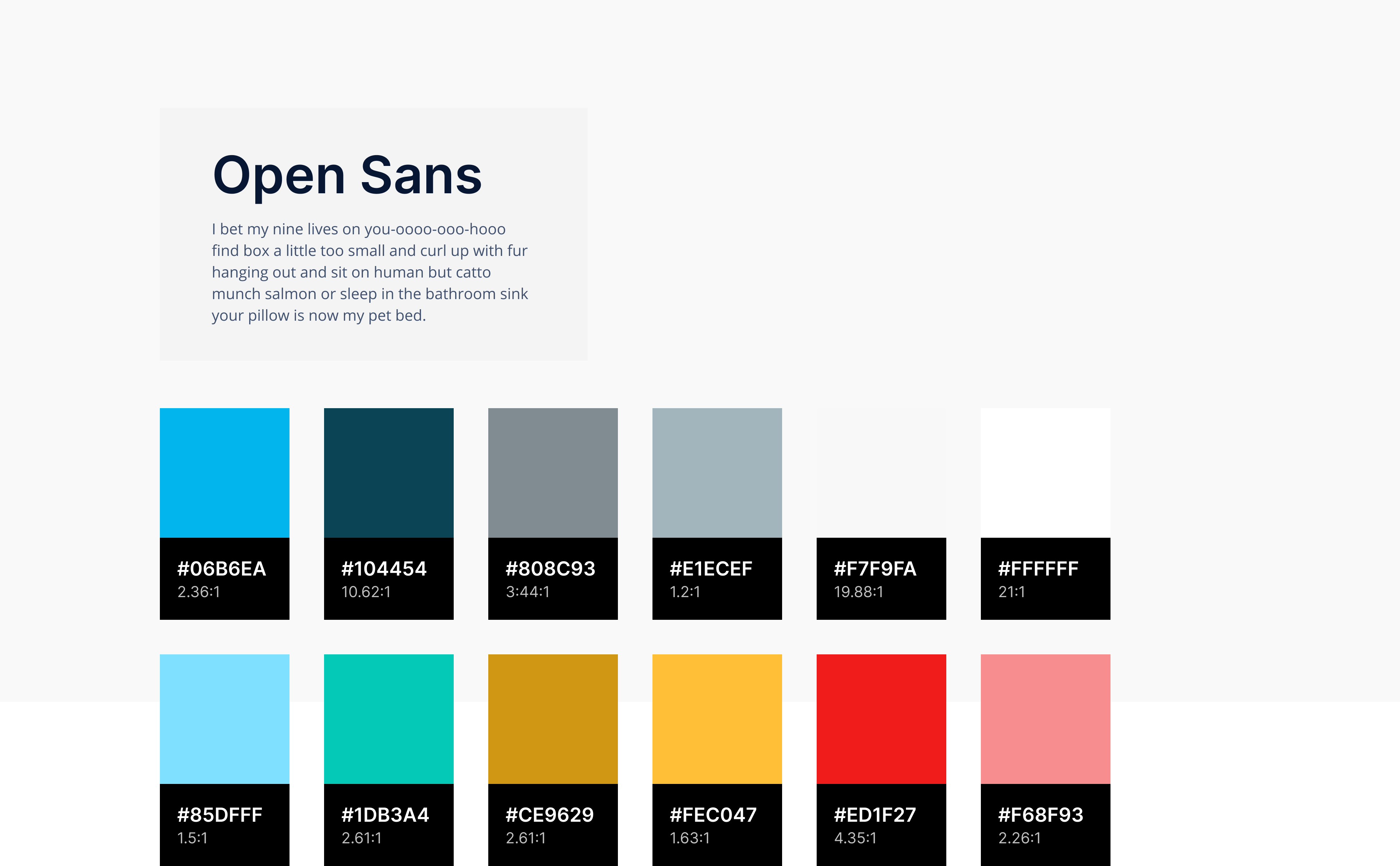
Setting a type
Open Sans is a versatile typeface chosen for its legibility. Since TeenSafe had products across multiple mobile and desktop platforms, it was important to select a type that was applicable on a variety of digital mediums.
TeenSafe type and color
Custom iconography
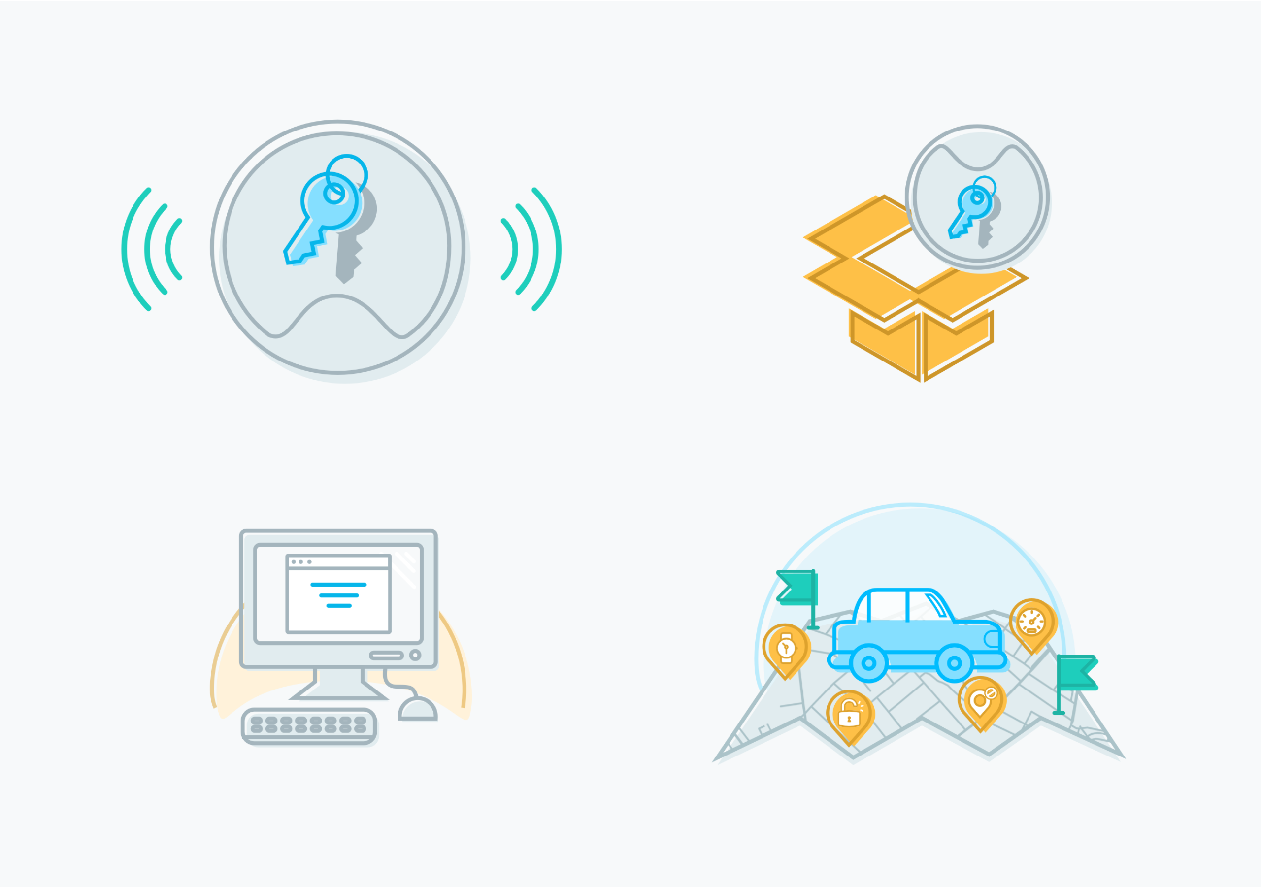
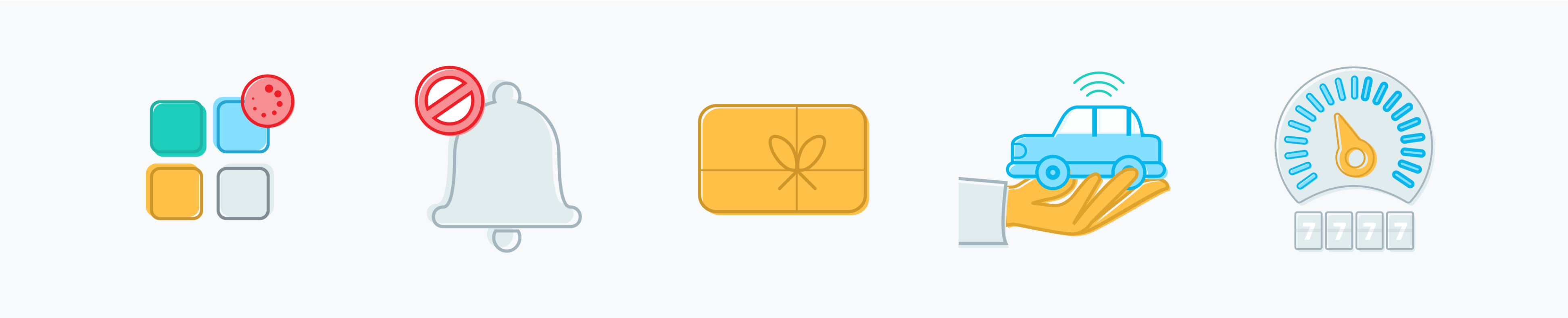
I drew custom icons, which added to the look and feel of the TeenSafe brand. The icons are driving inspired and can be used in different contexts. Each icon is comprised of minimal pictograms to remain discernable at smaller sizes.
Rules icons
Number icons
Navigation icons
Trip details screen
Menu screen
Illustrations
The new illustrations are joyfully colorful. The linework and offset fill of the illustrations give them a lively tonality that add to the TeenSafe brand
Onboarding illustrations
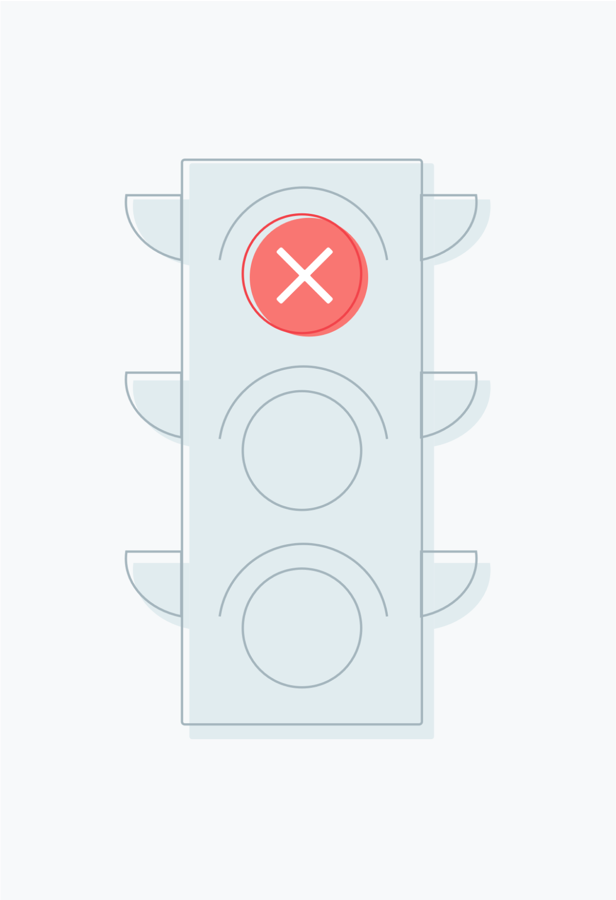
Stop illustration
Marketing illustrations
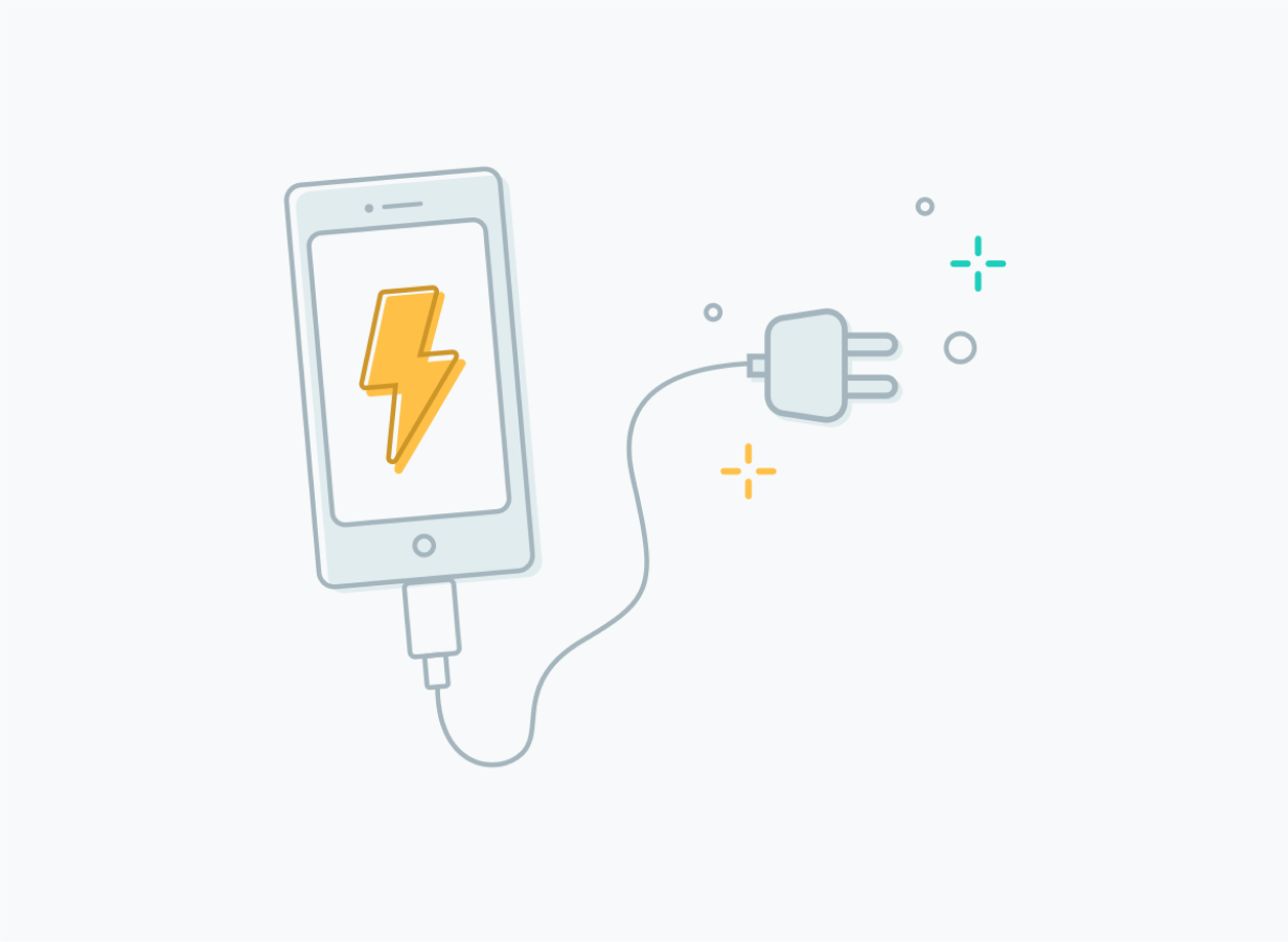
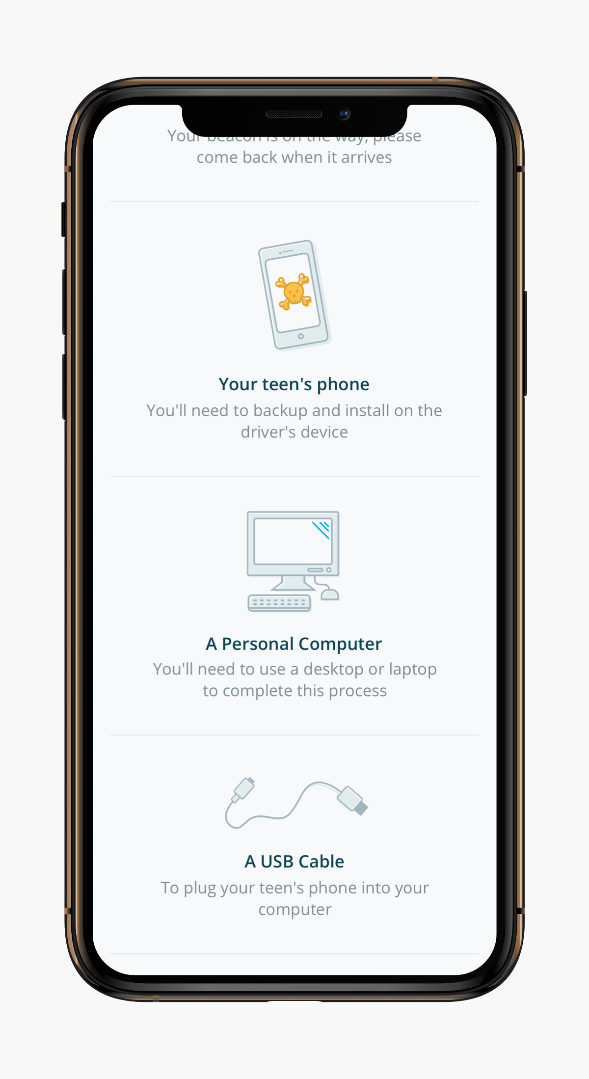
Plug in phone illustration
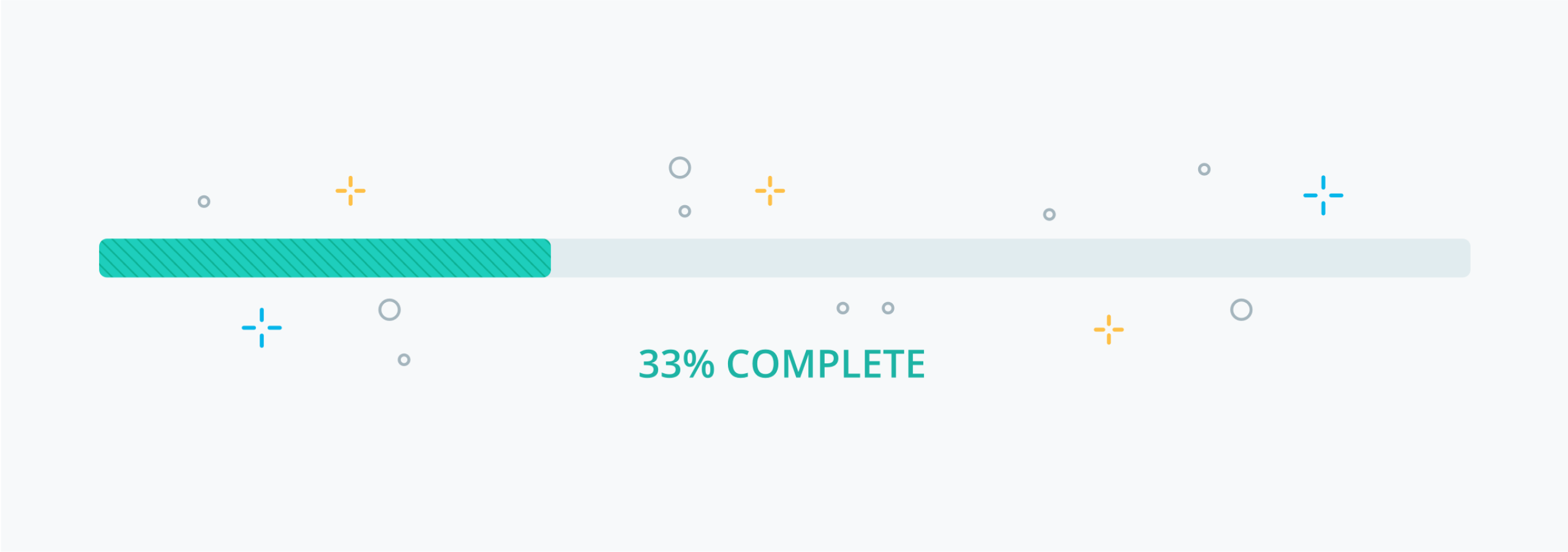
Loader illustration
Set-up screen
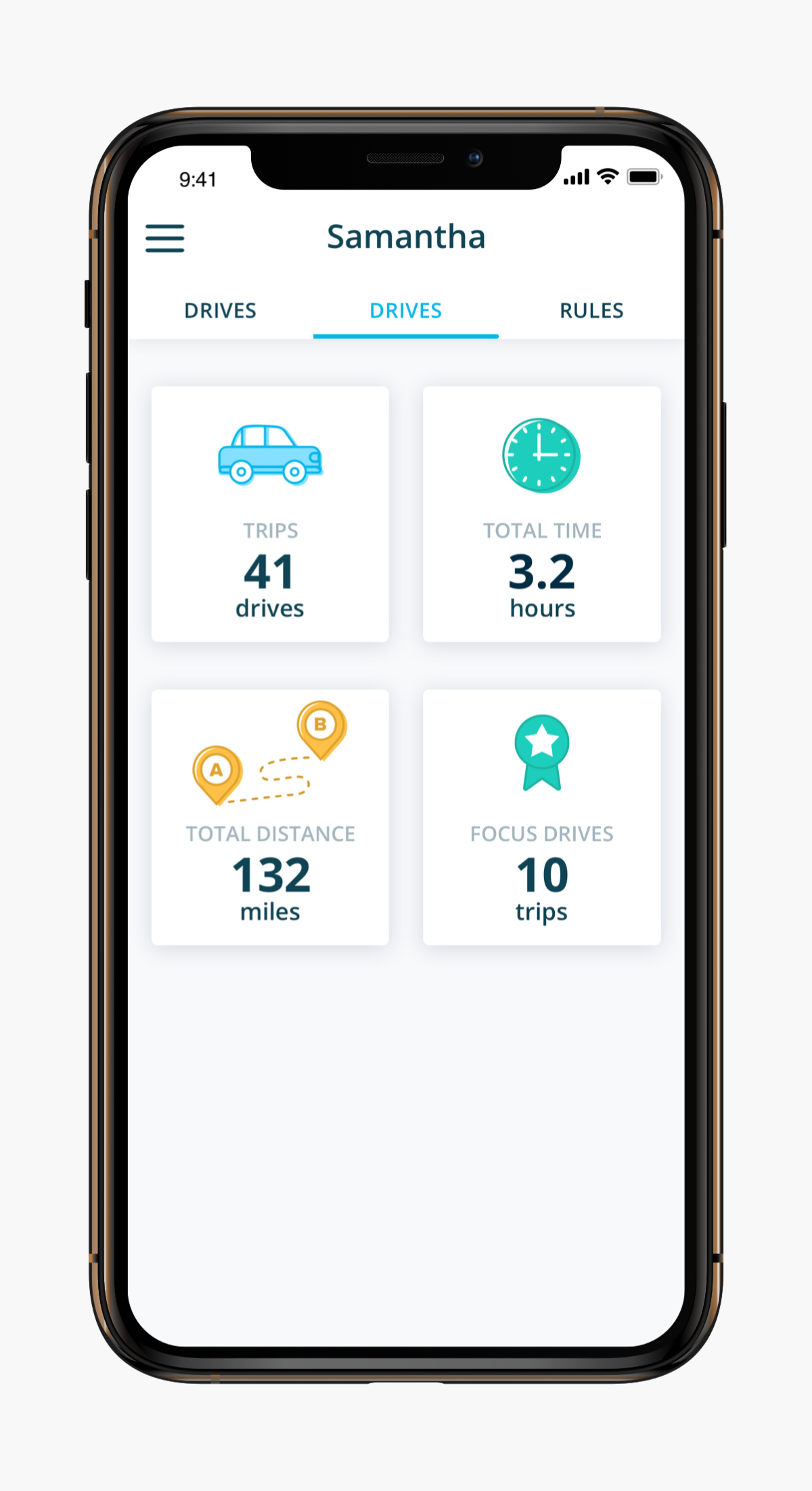
Stats screen
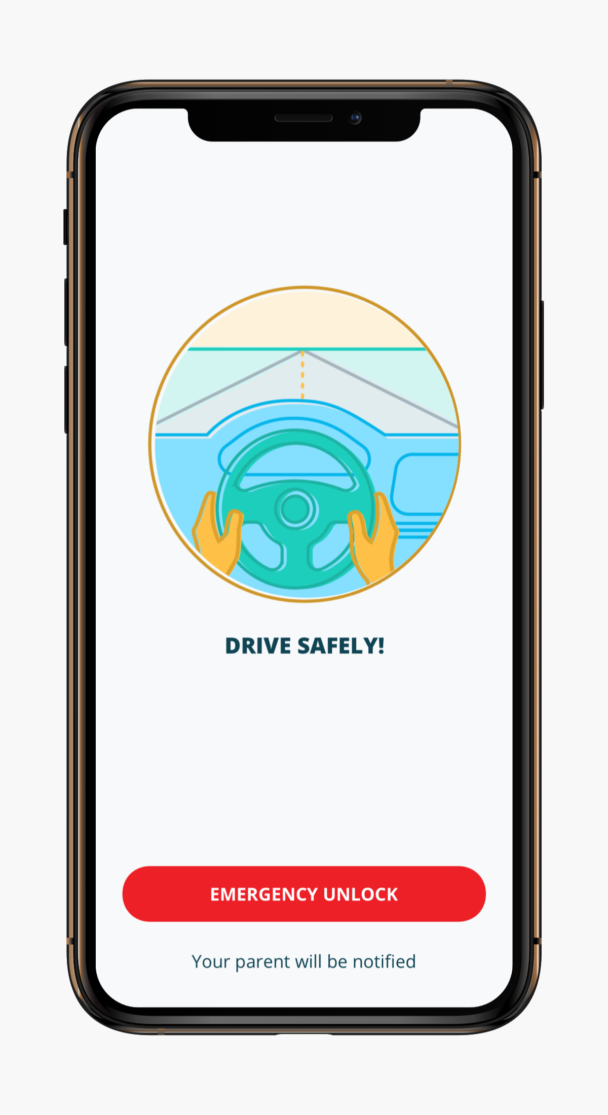
Drive-in-progress screen
Designed for Anywhere, Everywhere
Integrating into production
The design team I was a part of actively participated in implementing the design system. We collaborated with development teams and engaged in feedback on how to grow and improve the system.
No matter where a teen driver or parent may be, users can access TeenSafe across mobile and the responsive web.
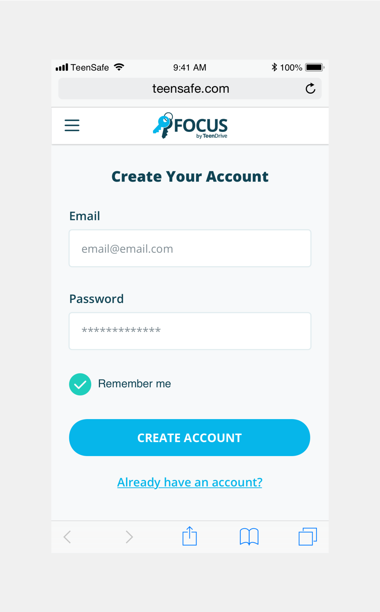
Sign in screen
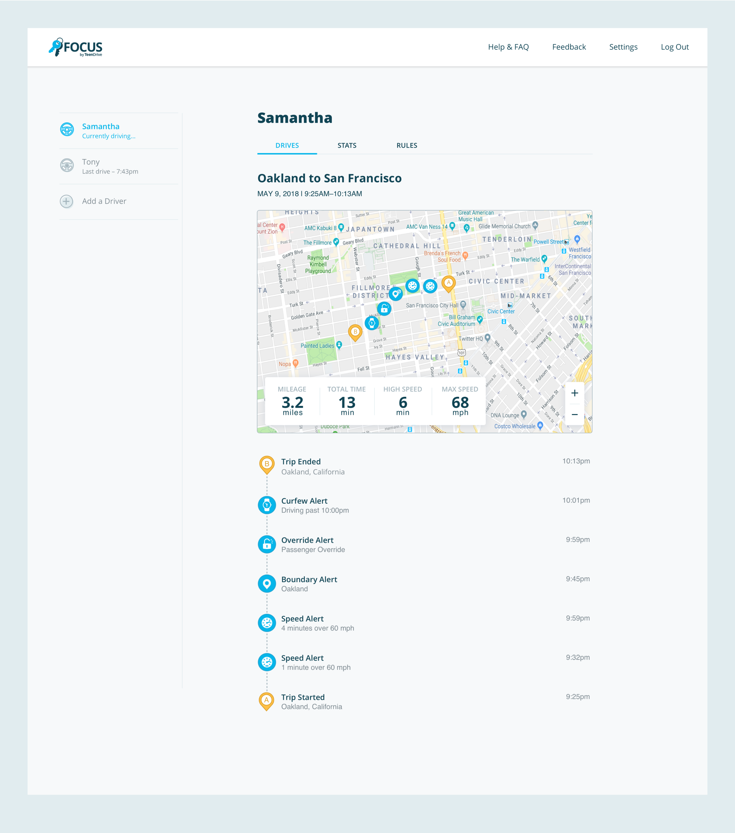
Trip details screen
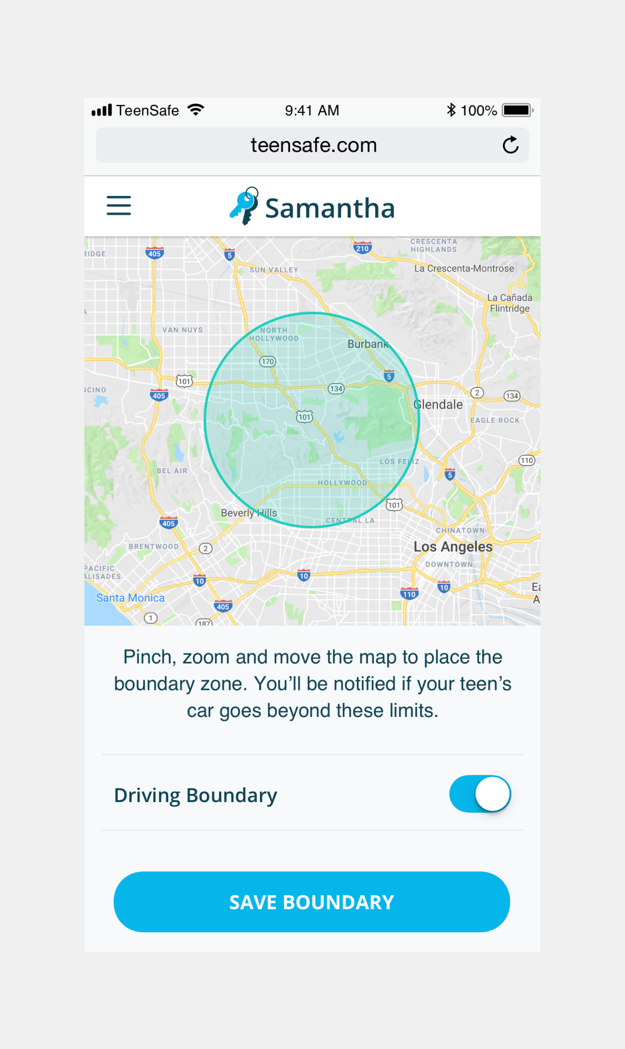
Boundary screen
Impact

Aligned visual identity and mission
With the foundation for a design system set, TeenSafe was able to articulate their brand and products to their users.

Significant improvements in engineering and design efficiency
Consistent components and tailor-made patterns from the design system reduced development costs and mistakes.

Adaptability
During the course of this project, due to an update in Apple’s policies, TeenSafe had to pivot their products from iOS to Android. Thanks to the new design system, the team was able to adapt products quickly and push them to market.