The Shift Simulator
Creating an interactive learning environment for mental health hotline volunteers
Client
Crisis Text Line
Project
Web app
Duration
8 months
Team
1 product designer,
2 product managers,
6 engineers
My role
UX/UI design, illustrations, usability testing
Overview
Background
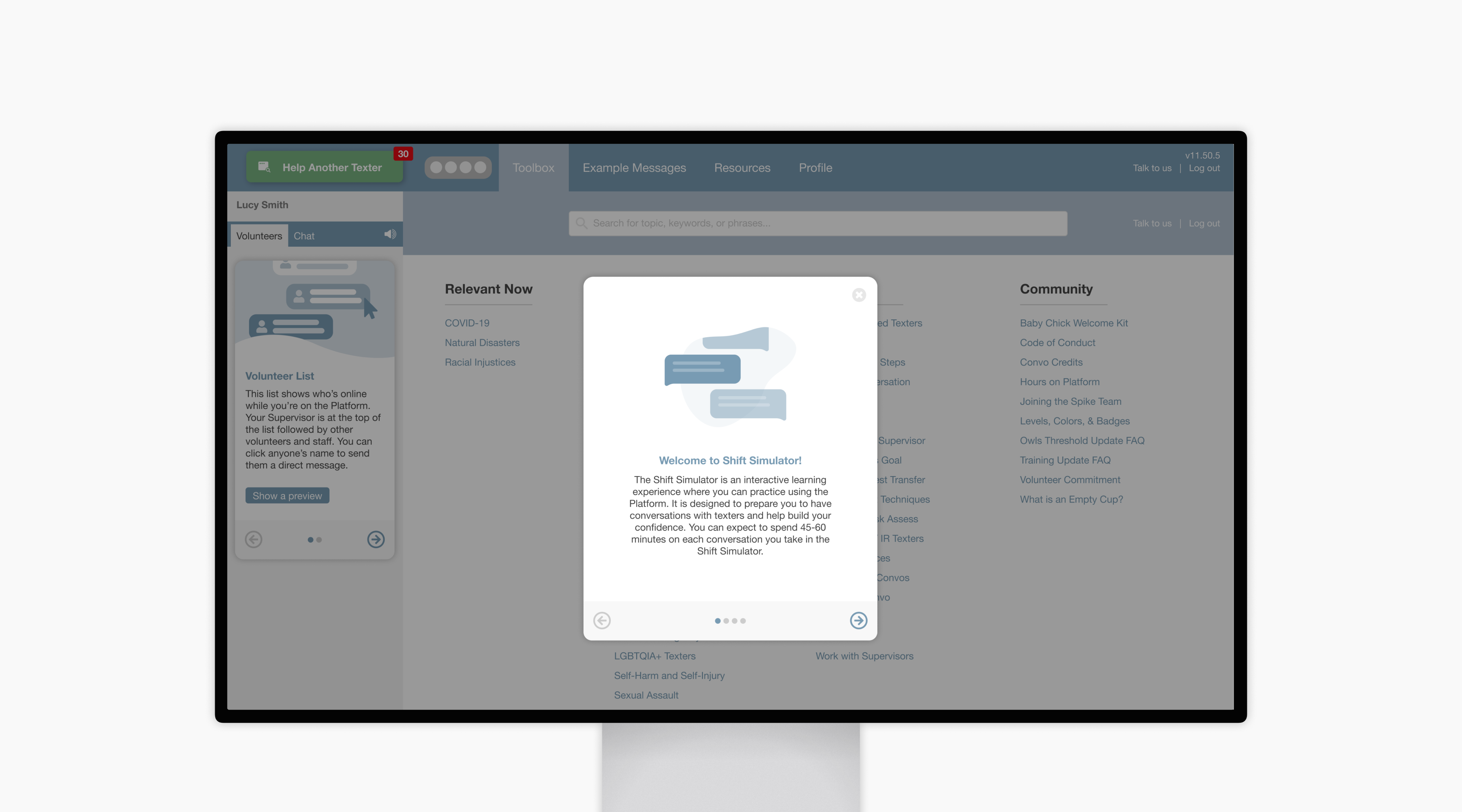
Volunteers at Crisis Text Line take 24/7 text-based conversations with people in crisis on a product called the Platform. Volunteers’ first shifts are often nerve-wracking because they’re 1) unsure about how to implement their crisis intervention training and 2) unfamiliar with the Platform in which to take texter conversations.
The Shift Simulator was a product born as a “playground” experience for users to get familiar with the Platform while also practicing and getting feedback on their crisis intervention skills. I came into the Shift Simulator project after some initial user research had already been done. The product still needed its own visual component library as well as a thought-out training experience for new and tenured users before it was released into the world.
Goals

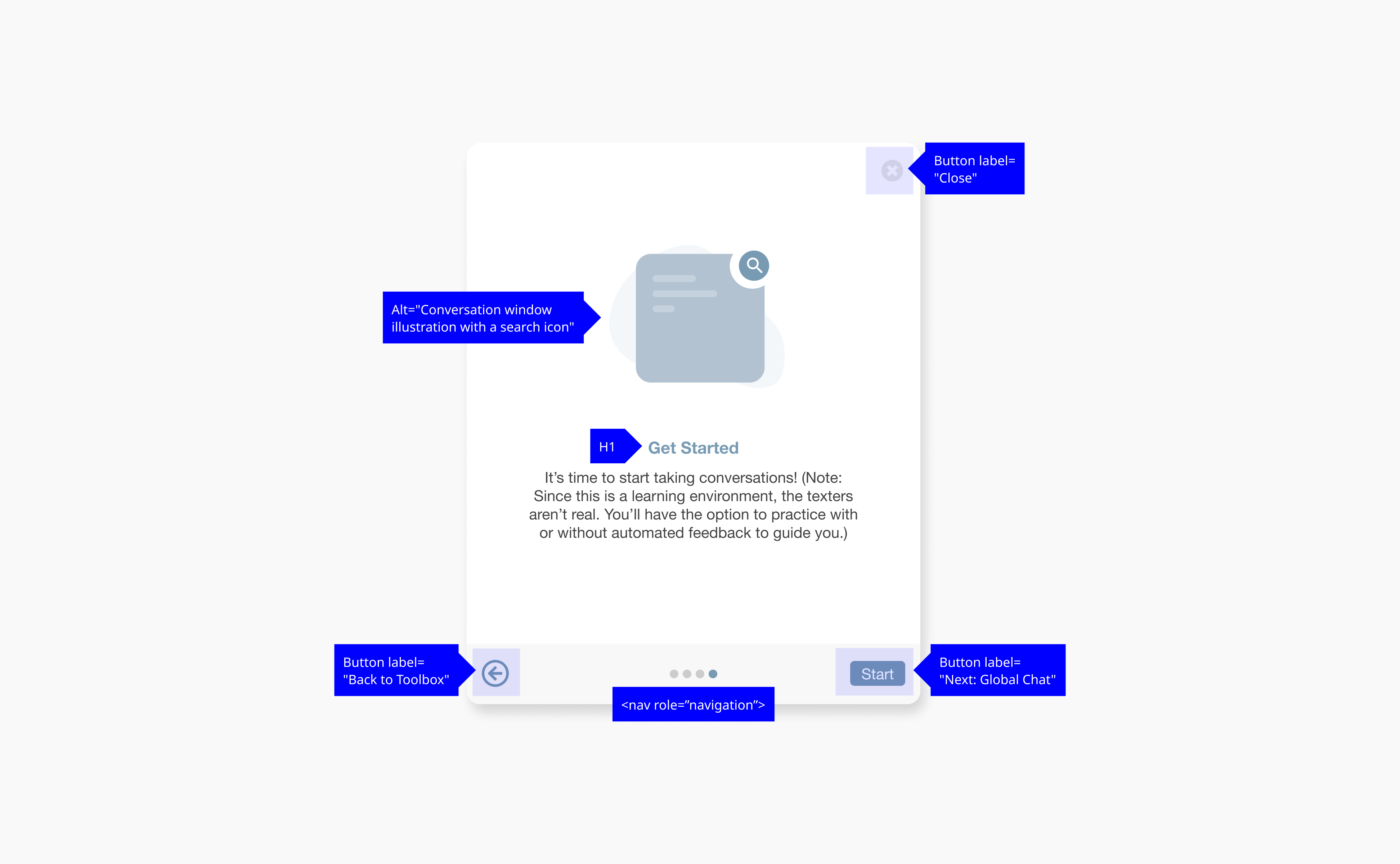
Accessibility
Build inclusive, W3C compliant components to accommodate Crisis Text Line’s diverse volunteer user base.

Education
Cultivate a learning environment that is informative and safe for users to learn and practice their crisis intervention skills.

Sustainable growth
Allow users of varying experiences on the Platform to grow and improve their crisis intervention skills as the product expands in complexity.
First Up, Visual Style
Inclusivity at the forefront
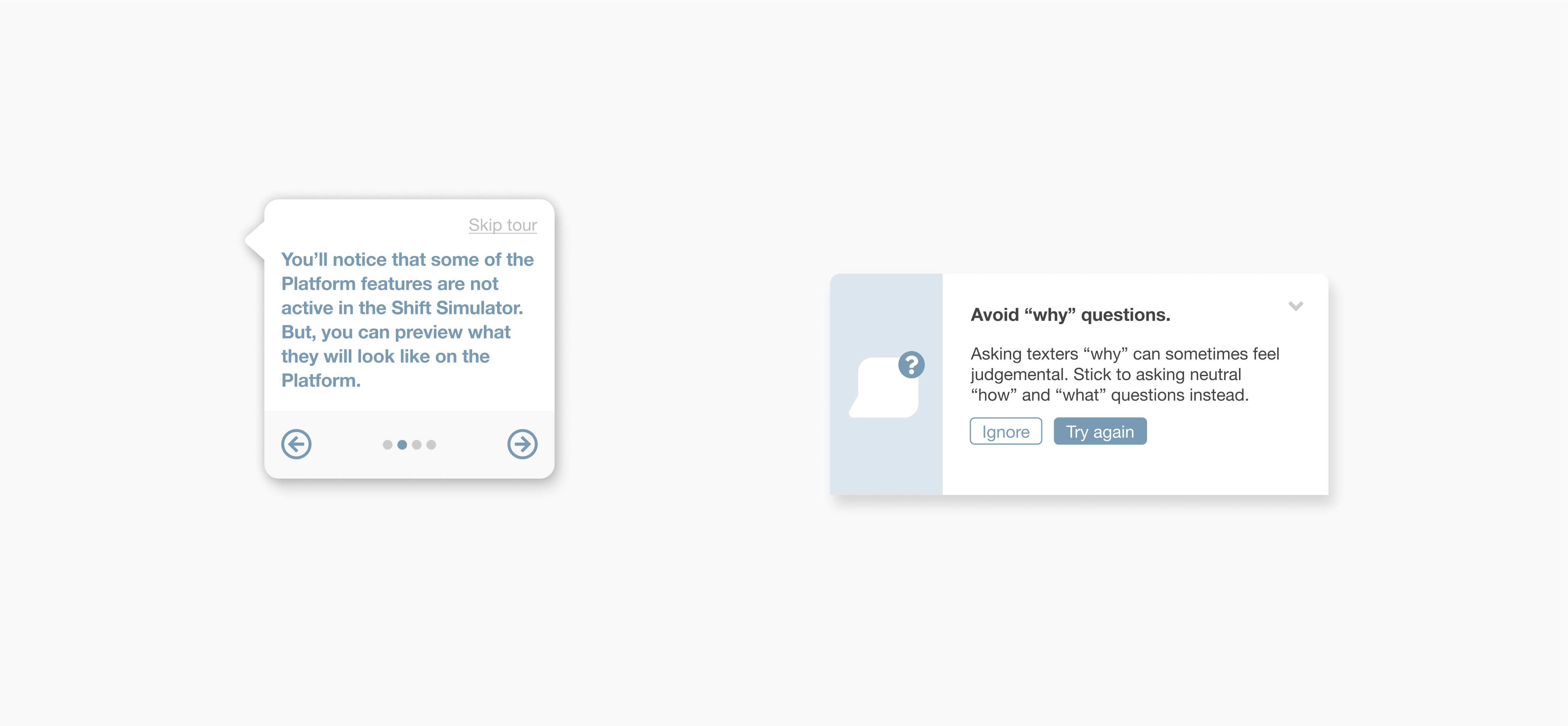
Crisis Text Line has volunteers from all over the United States, so accessibility was top of mind when I created new visual components for the Shift Simulator. Many of my design considerations, including additional text, interactive components, and buttons, made The Shift Simulator simpler to use and inclusive of users of varying abilities and backgrounds.
Labels for modal
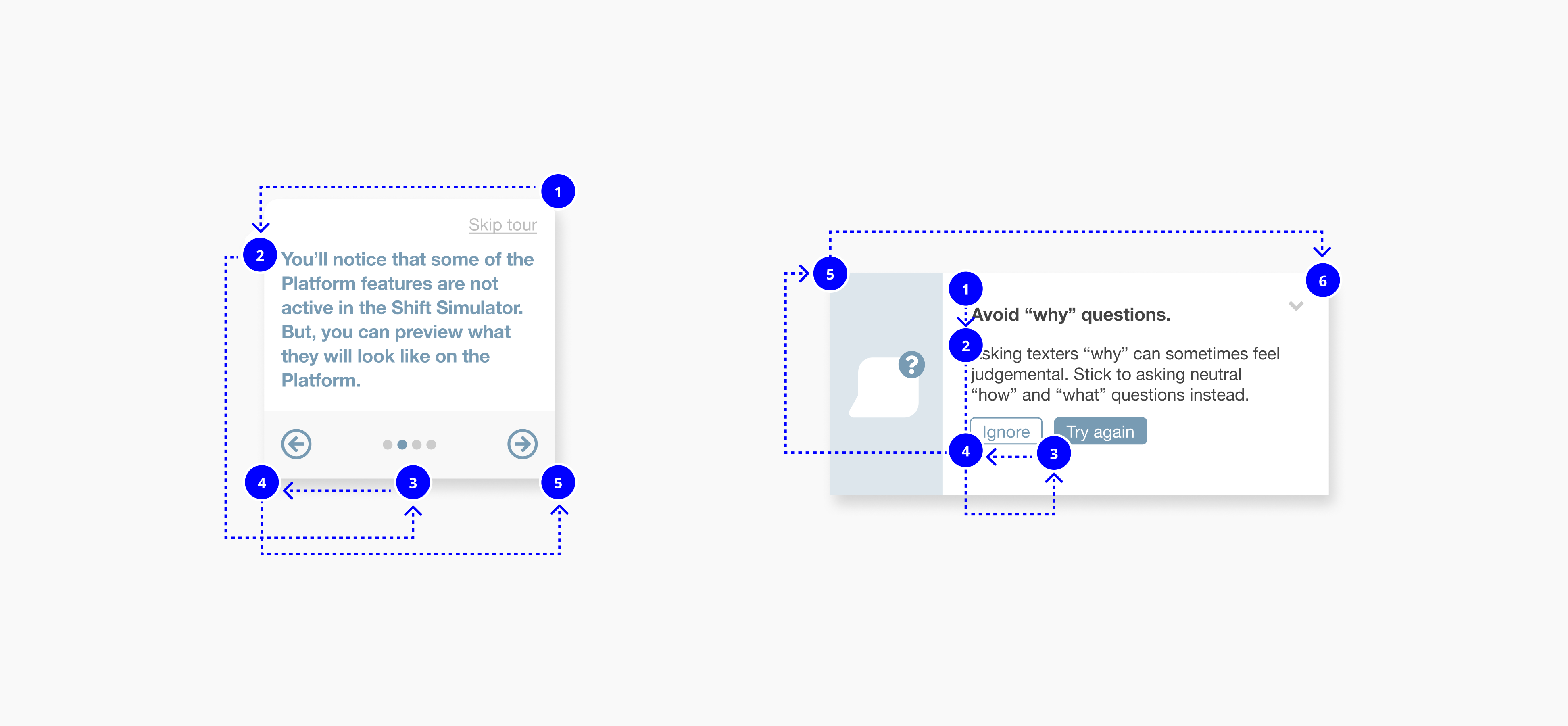
Reading order for Shift Simulator components
Due to shifting team resources, it was crucial to create components that would be lightweight and functional within the constraints of the existing brand. The Platform interface can be pretty visually dull, so I designed components that weren’t just practical, but also fresh and inviting.

Scalable, Hands-On Learning Platform
Getting new users grounded
Crisis Text Line has volunteers from all over the United States, so accessibility was top of mind when I created new visual components for the Shift Simulator. Many of my design considerations, including additional text, interactive components, and buttons, made The Shift Simulator simpler to use and inclusive of users of varying abilities and backgrounds.
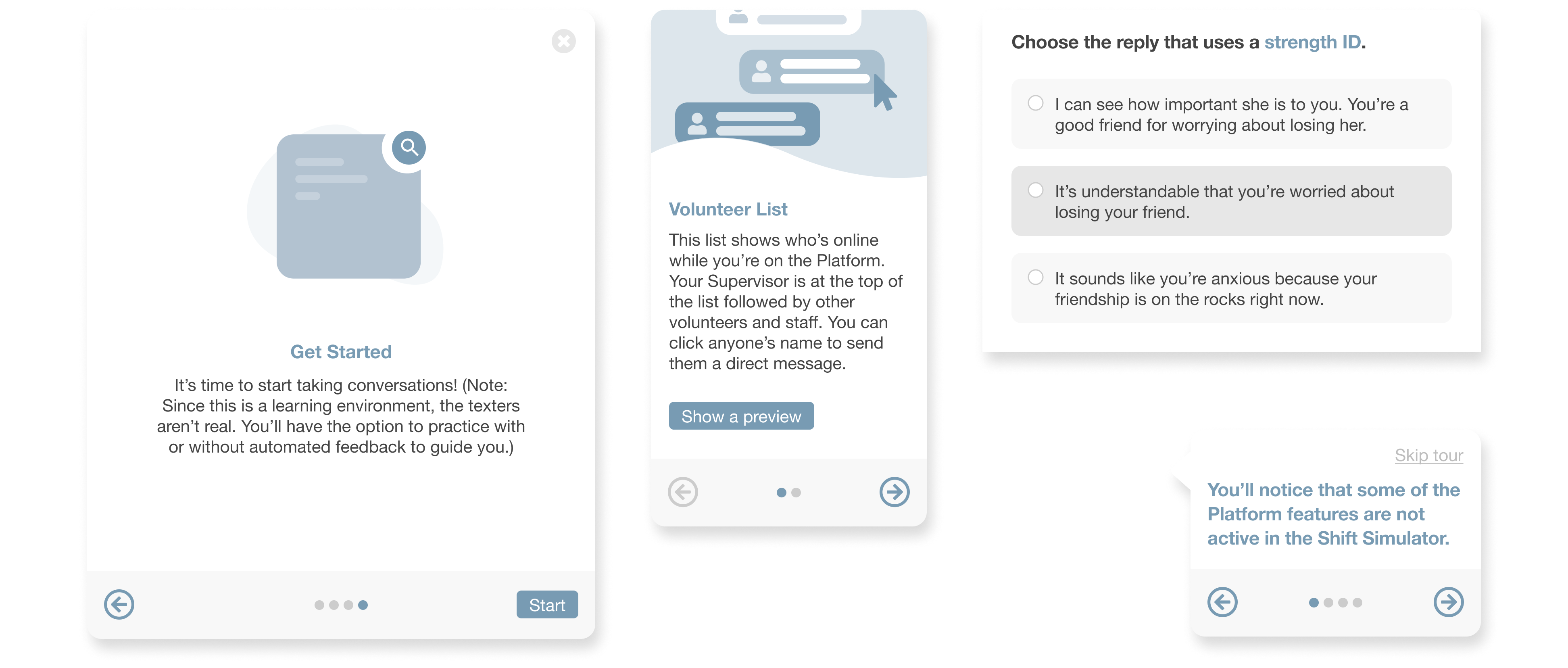
Shift Simulator onboarding
Continuous training
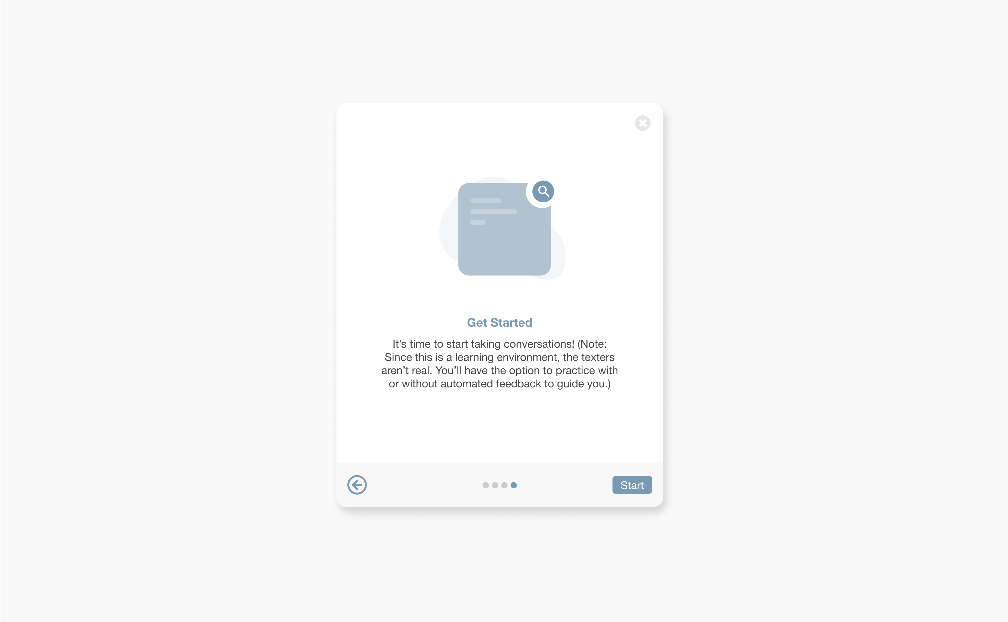
The Shift Simulator isn’t meant to be a passing stop in a volunteer’s training. Crisis Text Line wanted the product to continue helping their volunteers’ training needs, and the team wanted to build a practice conversation model. Another product designer and I were tasked with designing learning, practice, and feedback modules for volunteers. As a result, the Shift Simulator allowed users to roam the Platform environment as they pleased or dive deeper into crisis conversations.
Shift Simulator practice conversation selection
Feedback prompt
Multiple choice selection
Volunteer list preview
Global chat preview
Validating the Shift Simulator
Diversifying the research
To user test the Shift Simulator before launch, I developed an inclusive outreach method for research participants for a series of virtual usability testing sessions.
I re-examined all the ways Crisis Text Line’s user research processes have reinforced the social hierarchy (e.g. race, gender, age, etc.) in the United States. Current research methodologies were lacking because
- Research was catered toward the dominant user group (in this case, white women) which in turn might potentially further marginalized other user groups.
- Intersectional identities were not properly accounted for.
- Underrepresented user groups risk being constantly solicited for feedback.
Researching with older users
For the Shift Simulator, I hypothesized that age would be a crucial identity factor to look at. The assumption is that with older age, people are more likely to experience disability challenges such as loss of vision, hearing, and motor skills. There are also generational gaps and differences in education over the years so it is also likely that volunteers of various age groups will interact with an educational training tool differently. I used stratified sampling and oversampling to determine an outreach group of underrepresented users across age, race, gender, and disability status.
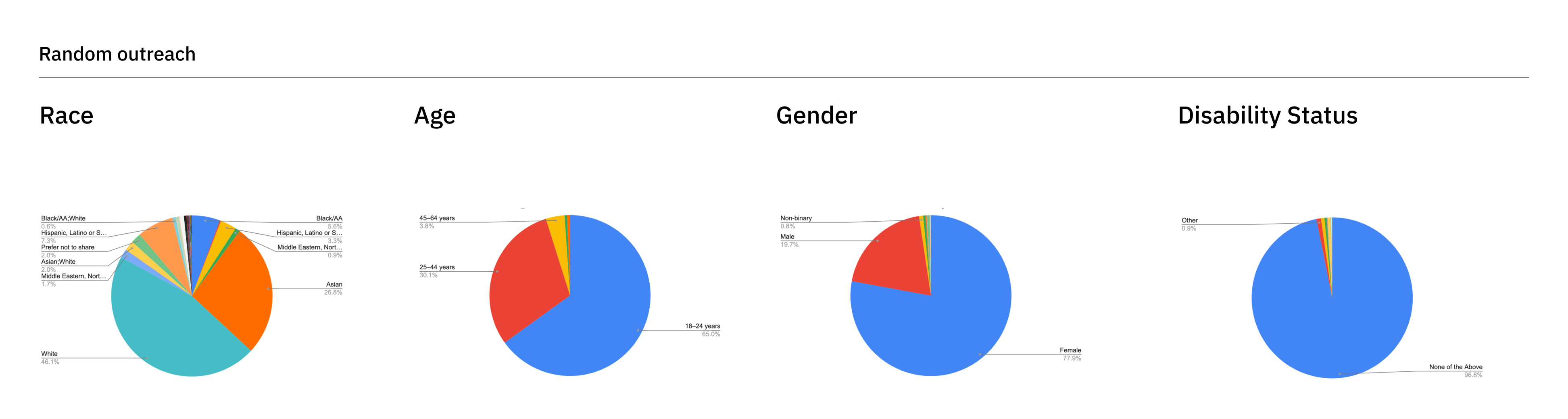
Research participant breakdown with random outreach
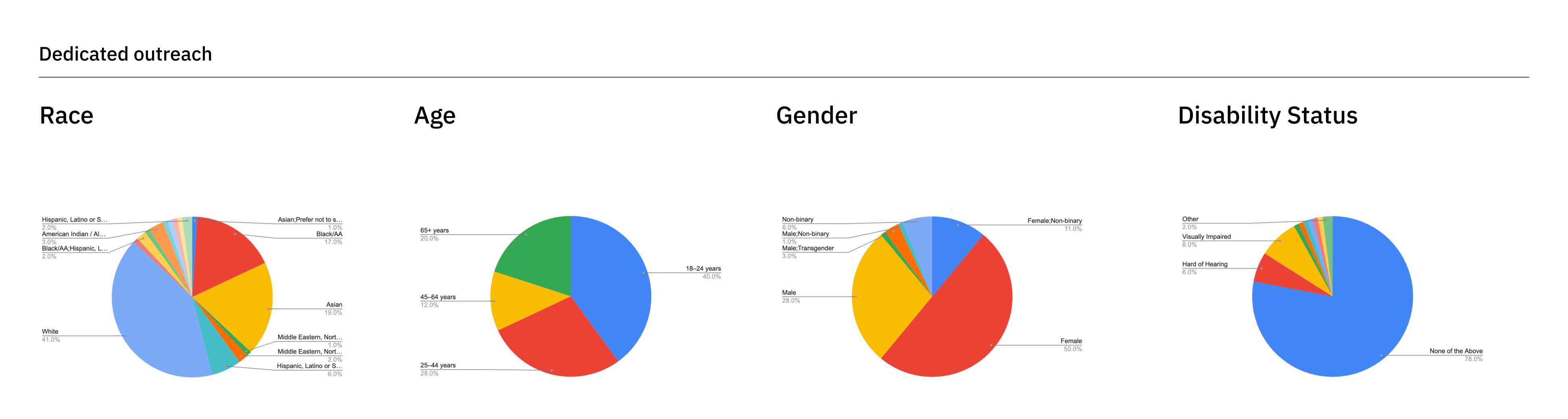
Diversified research participant breakdown with dedicated outreach
Usability testing findings
After conducting 120+ minutes of in-depth usability testing sessions, I was able to successfully validate that users were were able to confidently onboard and begin practice conversations on the Shift Simulator. Key findings from this research showed that
- Guided learning is an invaluable tool for volunteers when they first begin volunteer training.
- Continual learning paths are needed as volunteers gain more experience in taking crisis conversations and need to practice higher risk conversations and specific topics.
Impact
10k+
Crisis intervention volunteers
The Shift Simulator went live to thousands of volunteers across the United States.
150+
Coaches and supervisors
Internal Crisis Text Line coaches and supervisors were amazed at how efficiently they could use the Shift Simulator to monitor volunteer progress.
96%
Satisfaction rate
United States trainees reported that the training program either met or surpassed their expectations.
1st
Real-time feedback product
The Shift Simulator was Crisis Text Line’s first launched product to give users automated feedback to improve their crisis intervention skills.
Reception
When the Shift Simulator launched, it tremendously improved volunteer training initiatives and relationships with volunteers and internal coaching and supervision teams. The tool helped coaching and supervision teams more effectively communicate with volunteers and teach them to take crisis conversations. And beyond just helping new volunteers, the product also gave tenured volunteers and trainees the space they required to learn more and better serve people in need.
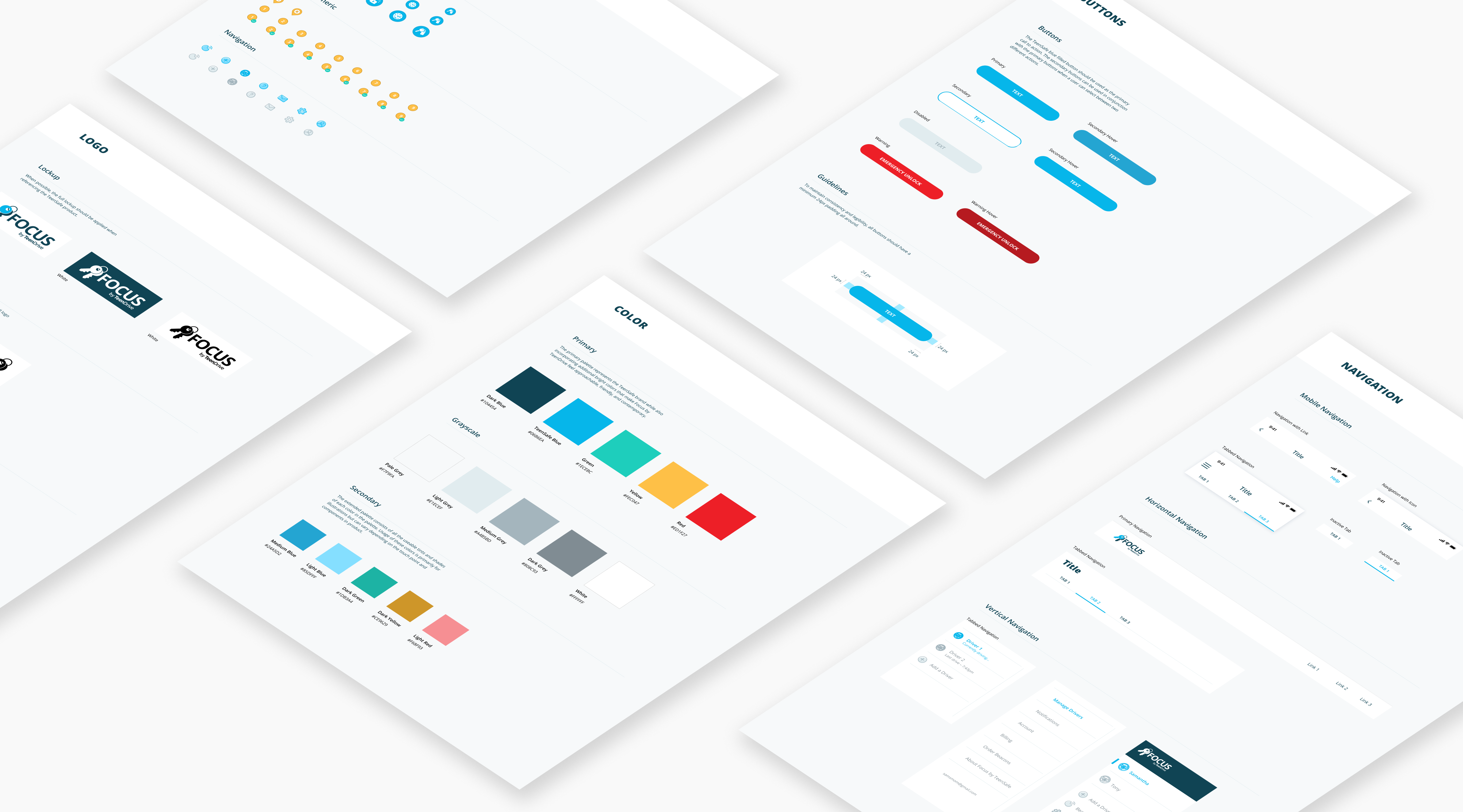
TeenSafe - Design SystemDesign system
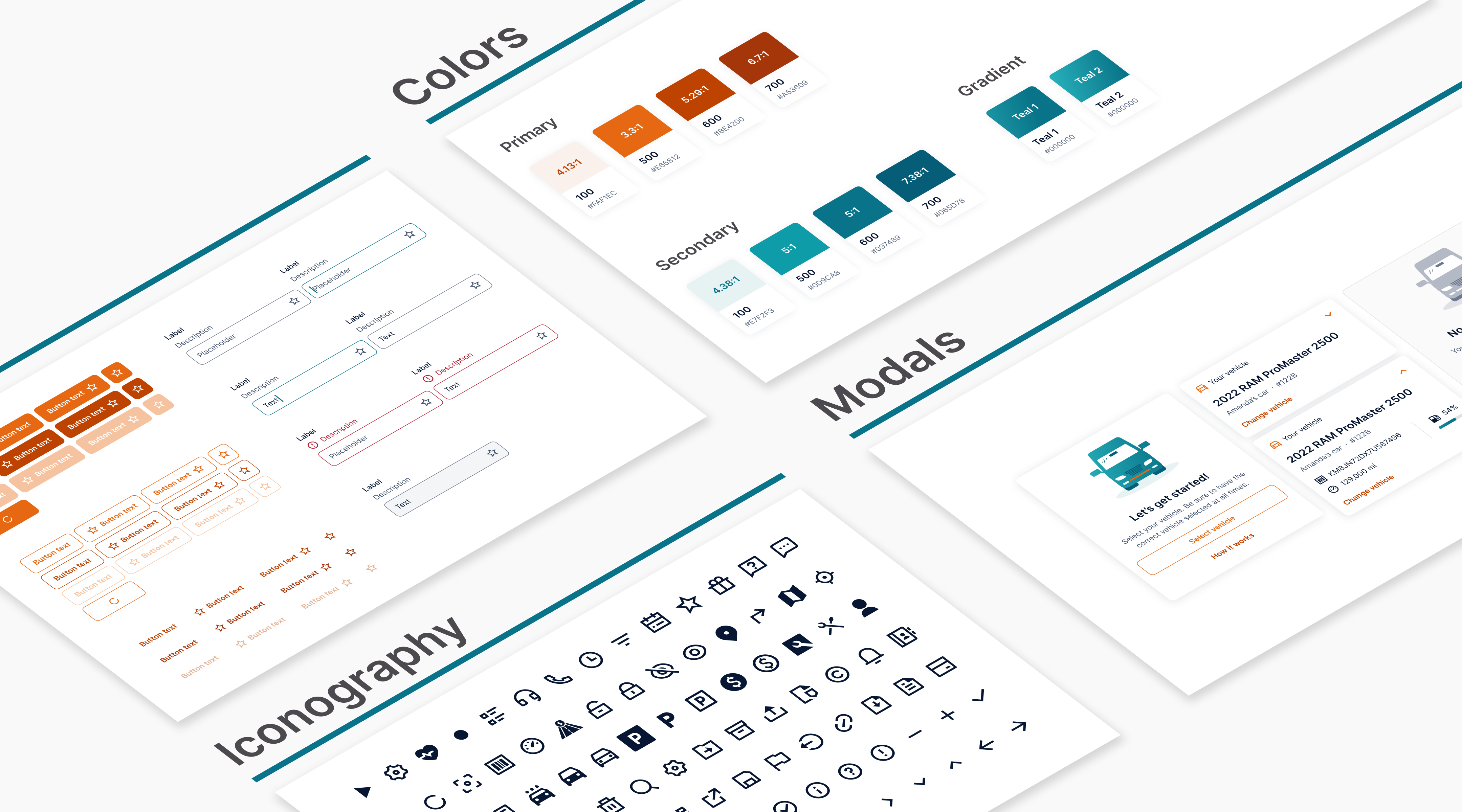
Car IQ - Design SystemDesign system
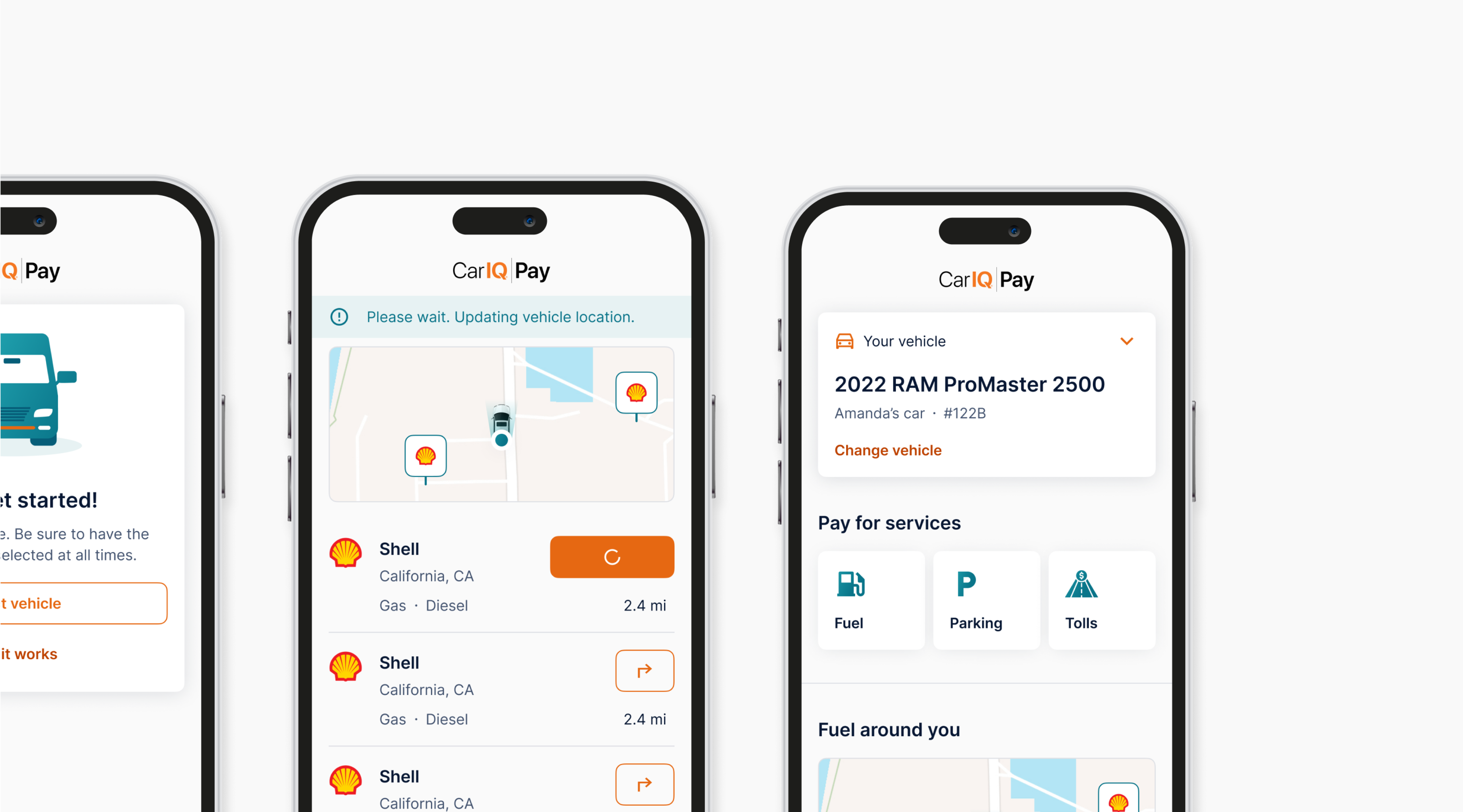
Car IQ Pay - FuelingMobile app